
As a new website owner, you’re probably ecstatic once you start getting significant traffic – but can you set this as the ultimate criteria for your success or should there be a second layer to your plans. Most ecommerce site owners proceed by incorporating a Call-to-Action, such as a Registration Process into their site plans.
While it may be an essential feature of the website, from a user perspective registering for website can become tedious and annoying. It’s something they like to get done with quickly. Research shows that 11% of US adults pulled out during an online checkout due to complex or lengthy site registration process. Other issues such as such as information privacy concerns and cluttered layout can also drive away a potential lead or customer. Due to the range of high-quality sites available, most user have established high expectations for registration process UI as well as UX choices, and they are hesitant to get onboard with anything that deviates from those standards. Following are some of the ways in which you can make the registration process as smooth as possible for your site visitors.
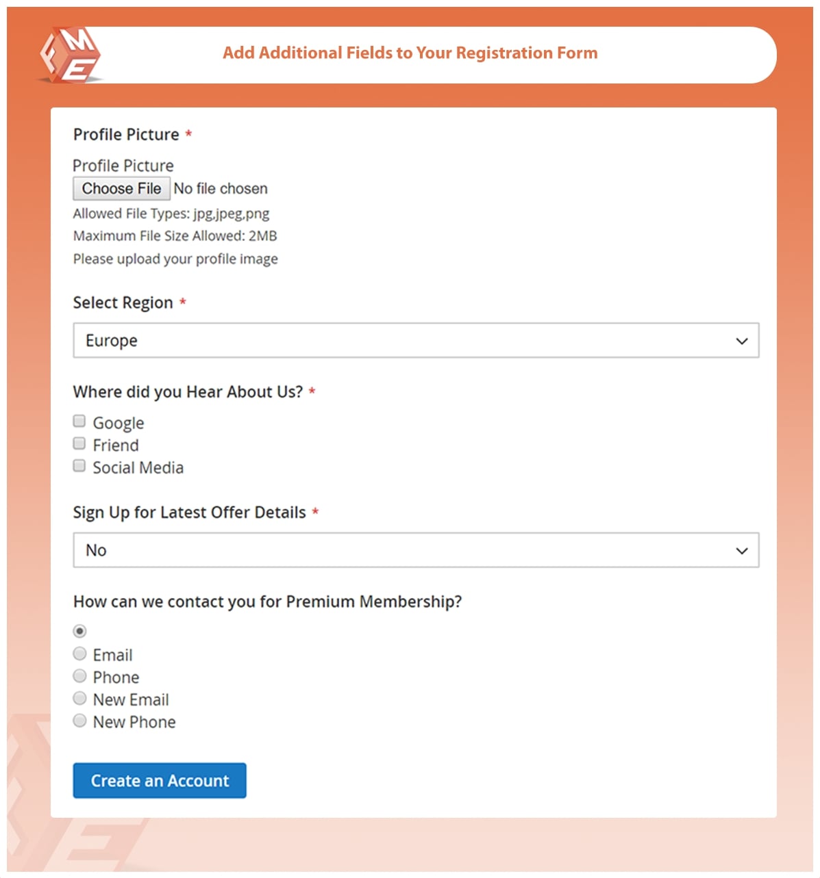
Scrap Unnecessary Fields
Demanding too much information from customers can lead to cart-abandonment. Try to limit the registration form to only essential fields that could help you develop a lead. Clearly mark fields requiring extra information as optional, so that users can skip them if they don’t want to share information.
Give the Customer Value
Very briefly, give your customer a reason with benefits to register for your site. The registration process should add some value to the user experience of your site.
Simplify Registration Process

Many ecommerce sites make the mistake of combining the registration process with the checkout. This makes the task seem too lengthy and can provoke the customers to leave the site early. Showing the progress and splitting up the task into clearly labelled steps will provide more guidance and help deal with anticipation of completing the process.
Focus on Field Assortment
Over the years, UI designers have developed a standard arrangement of grouping fields in a registration form based on logical flow. Users have also become accustomed to entering their information in that manners, starting with the personal information (such as name, etc.) and other contact information, the shipping/billing address and payment option or credit card information. Maintaining this order helps keeps user focused and avoids confusion.
Build Trust with Transparency and Security
Building trust is key to retaining customers for any ecommerce site. The privacy policy should be readily available to visitors and include 3rd party security badges such as VeriSign to relay top-notch information security.
Provide Refresh Captcha Feature
Image Source
Sites sometimes use Captcha form to prevent bot activity. However, at times the captcha can be hard to read/hear. In such instances, there should be a refresh option should be prominently available so registrants can proceed to the next step.
Allow Creative Passwords
Keeping a reasonable amount of restrictions on password will provide users with more options for passwords. Also, to reduce user frustrations, provide an indication of “valid password” next to the confirmation field so that users can correct a mistake right-away instead of having to comeback after filling the entire form. For more help, take guidance from Google’s “password strength” guidelines.
Facilitate Password Recovery Process
The online world is big and many users are registered on multiple sites. It’s easy to forget passwords, but if the password recovery process is too difficult chances are they won’t return to your site. So, make the password recovery process as clear-cut and as simple as possible.
Guide Customers through Form Field Errors
Users are bound to make mistakes when filling out a form. If the mistakes are not clearly highlighted it creates further confusion. Provide an explanation with prominent text next to the field creating issues, so mistakes can be easier to find and correct. You can also add these features through a Magento 2 custom registration form extension. These extensions offer tons features to enhance and optimize your checkout page.
Give Users the Comfort of Staying Signed-In
Using tokens to keep your user’s signed-in can make your site more user-friendly for frequent user and increase engagement.
Add Social Sign-In Feature

Providing alternate methods such as social sign-ins saves user’s time spent on the sign-up process and makes it easier to sign-in. It also allows site users to gather pre-authenticated information about users.
Don’t Forget Guest Checkout Option
Some people just might be in a hurry, but why loose that lead by getting them entangled in the length registration process. Guest Checkouts are ideal for user in a hurry or those who are not looking for long-term commitment.
Conclusion
When laying-out your registration process, see what features enhance user experience. The above listed tips are some of the basic methods in which you can improve conversion rates and deal with cart abandonment issues. The key is to retain features that add value to the registration process and make changes where there is no practical use of a feature.
Author Bio
Basim Butt is a Digital Marketing & E-Commerce Specialist at FME Extensions, a leading Magento Design and Development agency. He manages digital marketing of all Magento 2 extensions developed by FME. You can find him on LinkedIn.